In progress
Lunar
Botanical wellness. Everything in it was thrown away first.
Scope
Brand strategy · Naming · Visual identity · Emblem · Typography and colour · Packaging
Natural as a consequence
The oils that do the most for skin are almost all made from seeds. And the seeds are almost always a byproduct.
Pomegranate seed oil comes from what's left after juicing, and it takes an enormous quantity of fruit to press a small amount. Prickly pear seed oil needs close to a tonne of fruit for a single litre, which is why it costs what it does. Grape seed, raspberry seed, apricot kernel, all of them are what remains once the industry has taken what it wanted.
So Lunar isn't natural as a claim. It's natural as a consequence. The formula is short because the ingredients are scarce, and scarce because they were never meant to be collected.
What that changes for the person using it is quite small and quite real. Fewer things on the shelf. A product that smells of the fruit it came from rather than of an idea of freshness. And a reason to use it slowly.
The identity
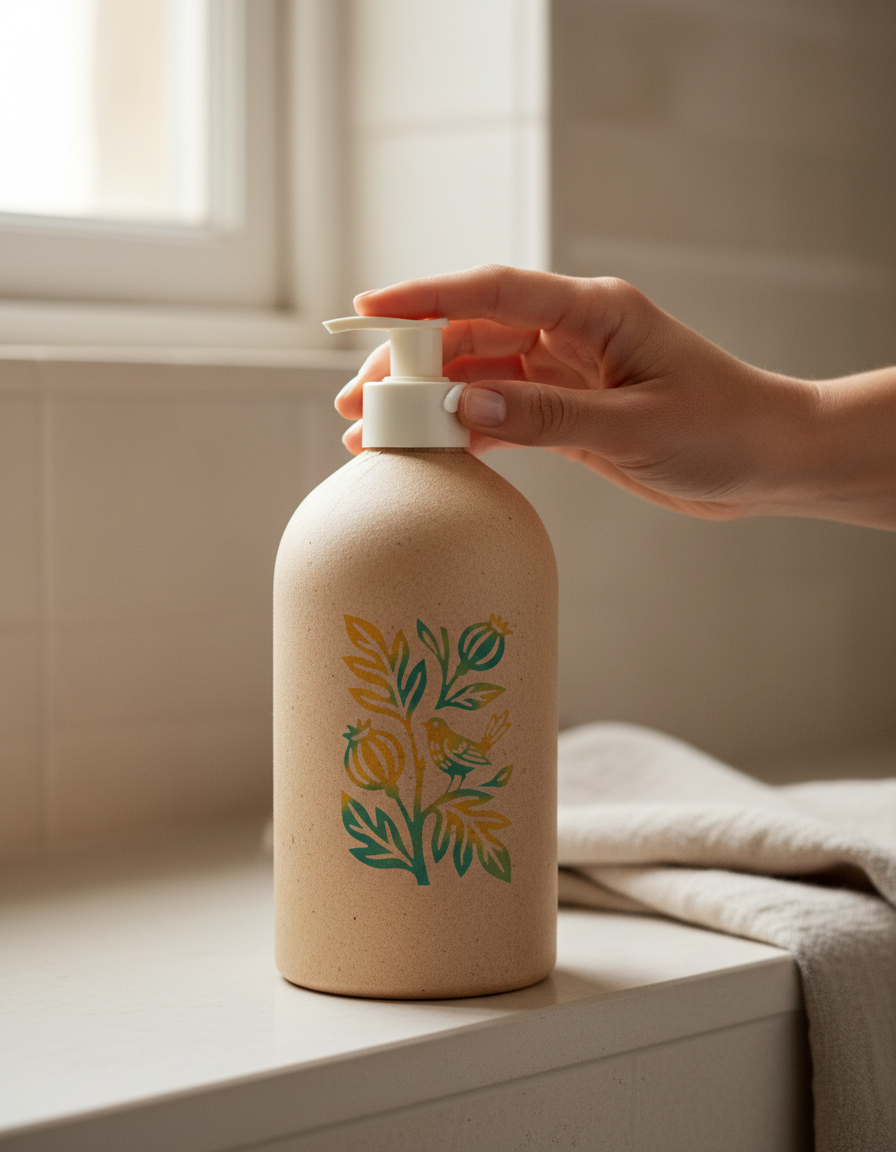
A climbing vine with a songbird in it, and pomegranates in the branches, which is where the oil comes from. The line is thinned so the whole thing breathes, because wellness lives or dies on the feeling of air.
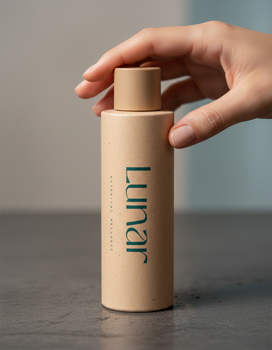
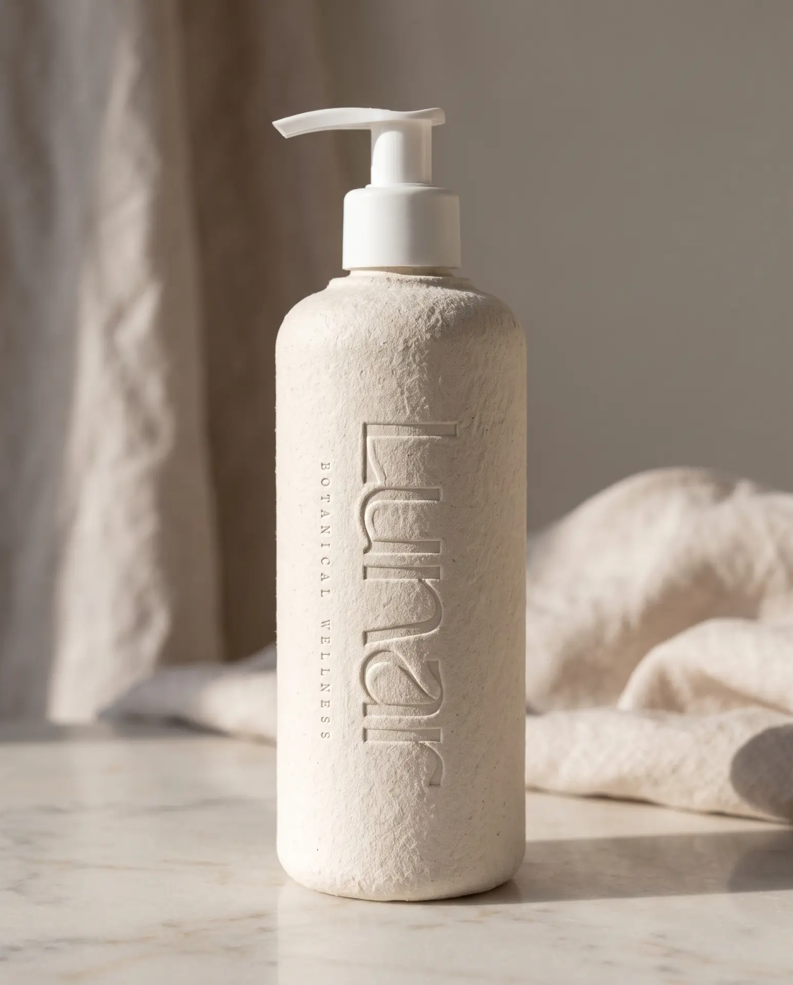
Prettywise sets the name in lowercase. High contrast, modern, quiet. It doesn't perform calm, it just is. Turquoise and warm yellow pool into one another in soft patches, like two inks overprinted by hand rather than a gradient made by a machine.