In progress
Reverie
Botanical spirits. Distilled from what the wine left behind.
Scope
Brand strategy · Naming · Visual identity · Emblem · Typography and colour · Packaging
One of the oldest circular spirits
After a harvest is pressed, what remains is pomace. Skins, seeds, stems. In Italy they've been distilling it into grappa for five hundred years, in Spain it's orujo, in France marc. Which means one of the oldest spirits in Europe is also one of the most circular, and nobody markets it that way because nobody thought it needed saying.
Reverie starts there. Pomace from small wineries, distilled slowly, then rested with botanicals that are themselves offcuts: citrus peel from juicing houses, herb stems, spent flowers from oil distillation.
There's a detail I love about this. The same pomace that becomes Reverie also becomes GrapeSkin at VEGEA in Milan. One harvest, one pile behind a winery, and it walks out as a spirit, a leather and a bottle. The whole brand argument is already sitting in the supply chain. Nobody has to invent it.
The identity
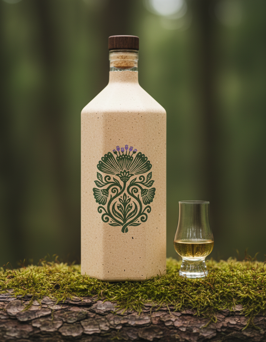
The emblem is drawn in folk woodcut language, symmetrical and dense, carved rather than sketched. The kind of mark that used to appear on a bottle because someone believed in what was inside.
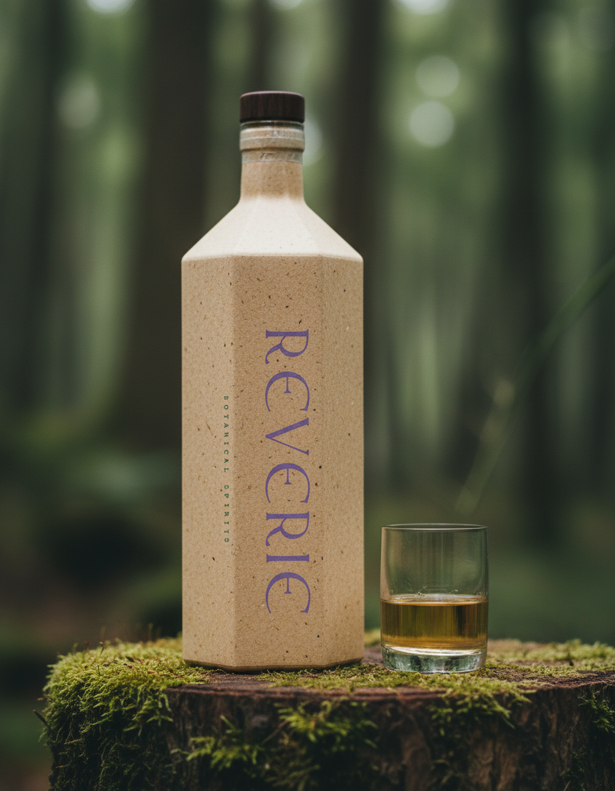
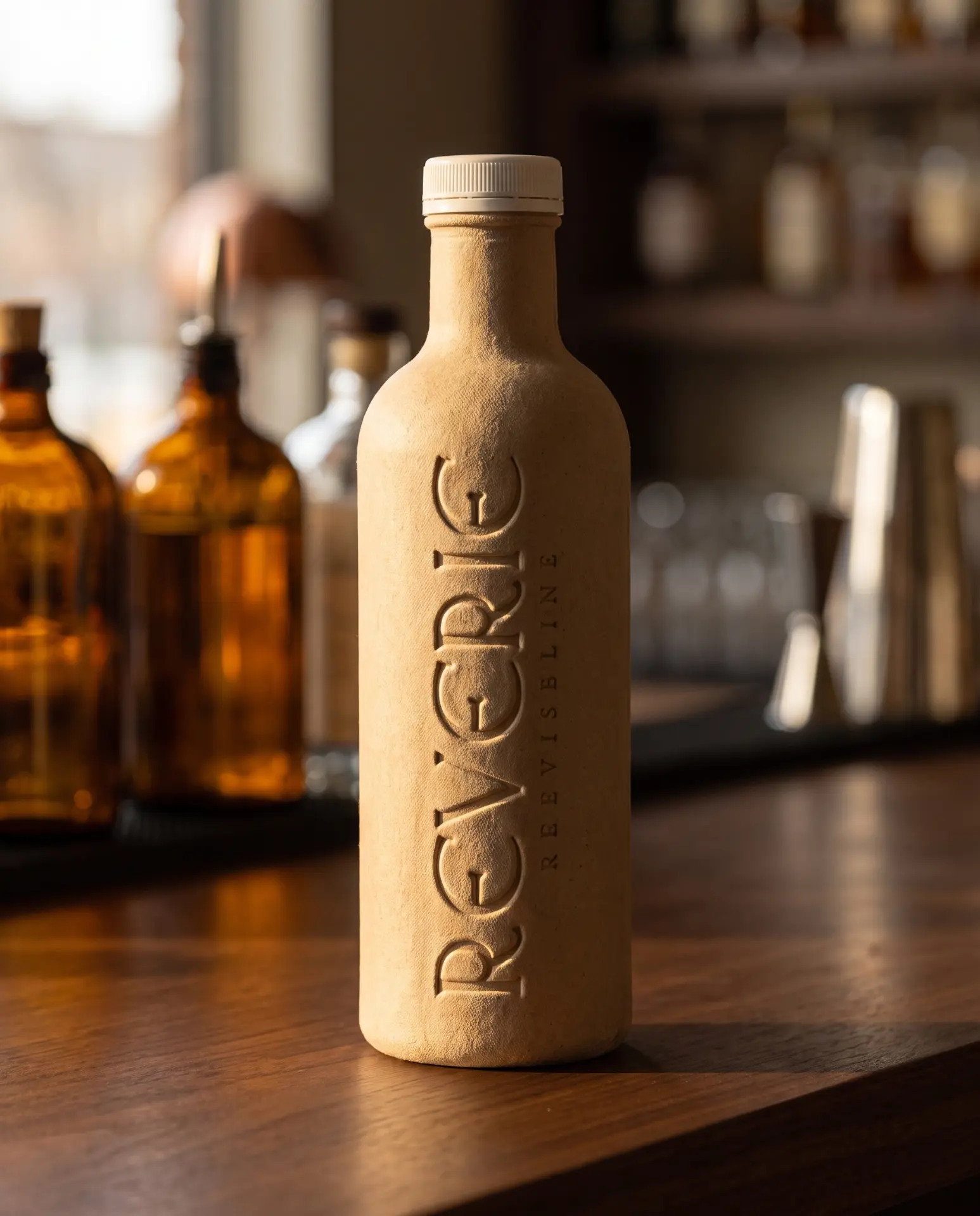
Rallisaguen carries the name, a flared serif with real weight, unfashionable in the best way, and it holds when pressed into fibre where a finer face would close up. Deep herbal green with a lilac crown. Green because the drink is botanical and the material isn't, lilac because a spirit should have something strange in it. The name runs vertically, so you read it the way you hold it.