Extra 21
Where families grow together.
Scope
Brand strategy · Positioning · Core messaging · Visual identity · Social and print
From charity to belonging
Extra 21 is a Romanian nonprofit that supports and educates families raising children with Down syndrome. Their wish was simple: every family should feel seen, supported and strong.
We found the heart of it in one line: "Where families grow together." It puts parents first, with their doubts and their strength, and it moves the story from charity to real belonging.
The message became: Extra 21 is the sanctuary where parents find real acceptance and support, so they can grow resilient and connected. Words parents can say with pride, in the lift, online and in their community.
The identity
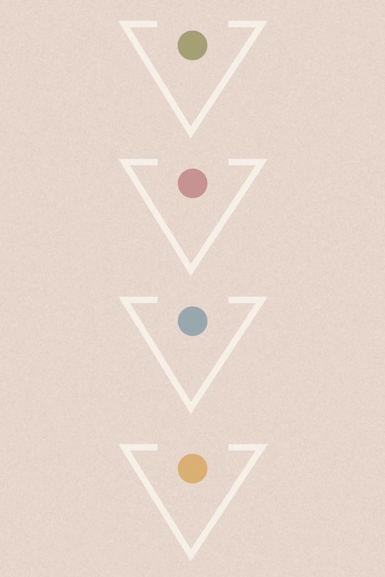
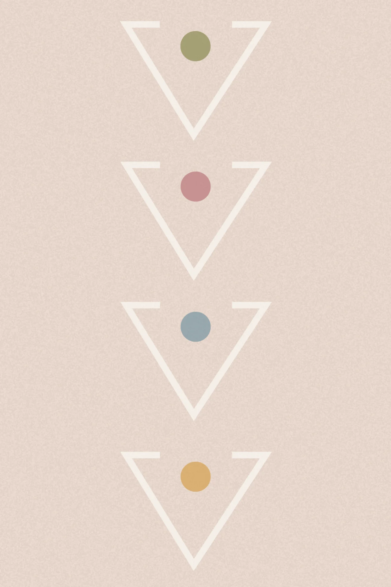
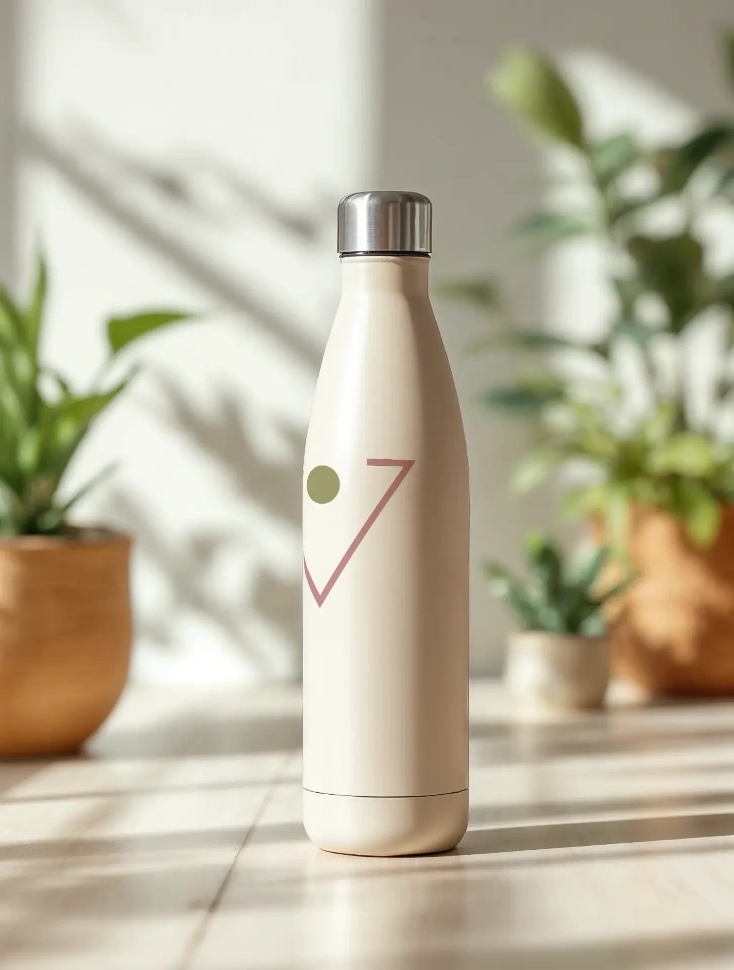
The logo is an open sanctuary: a downward triangle. It's a shape found across nature and old stories, open, welcoming and rooted. A safe place to rest, heal and connect without shame.
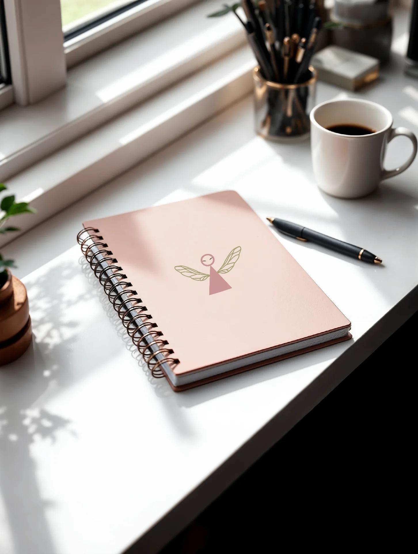
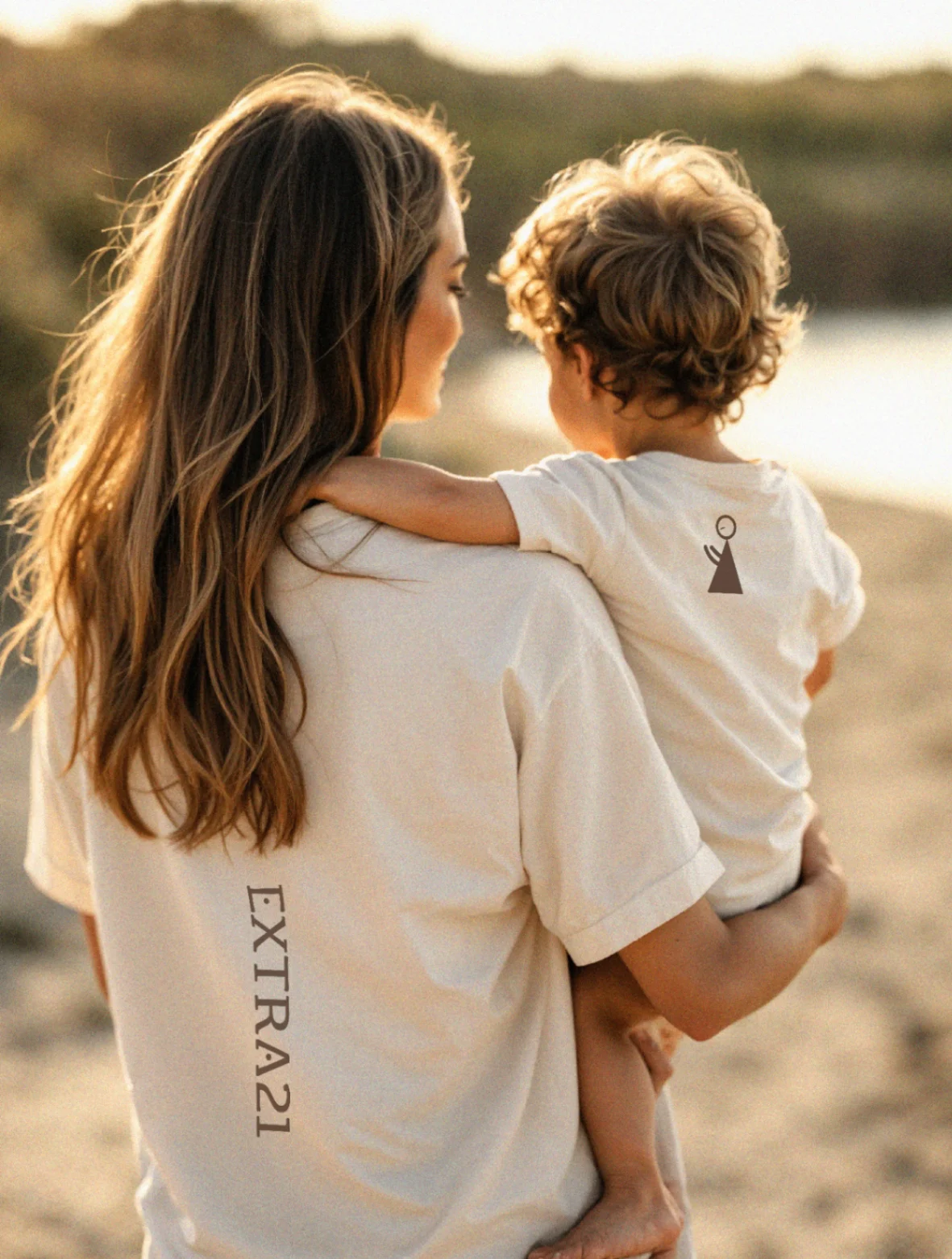
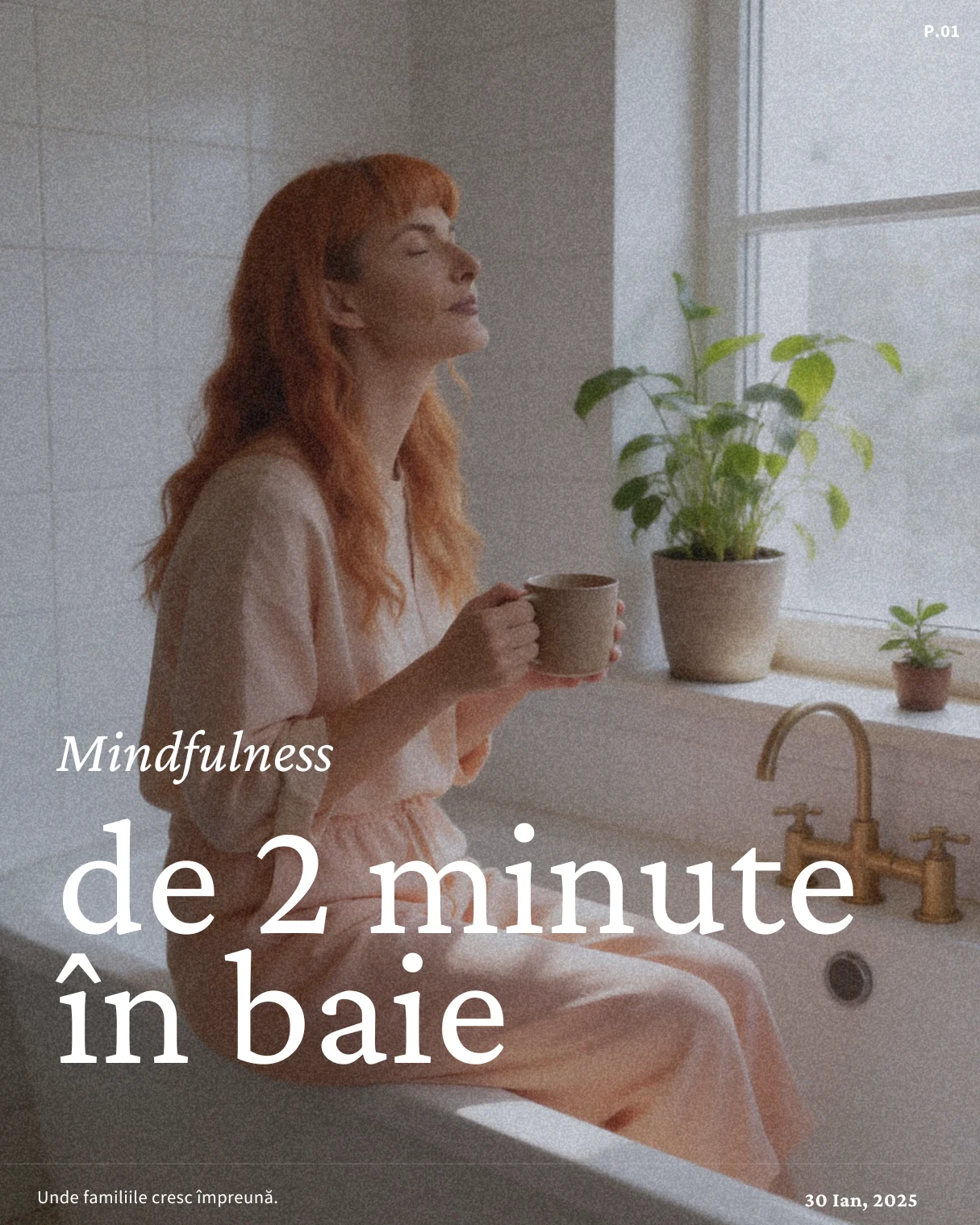
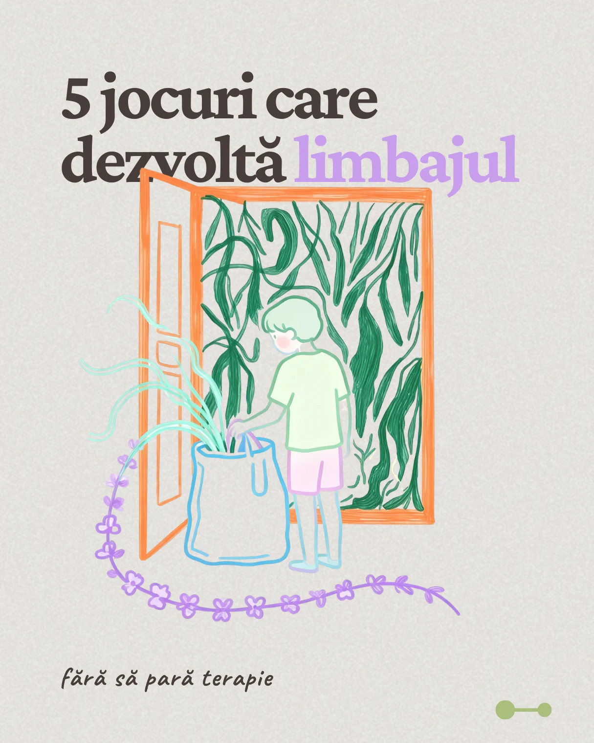
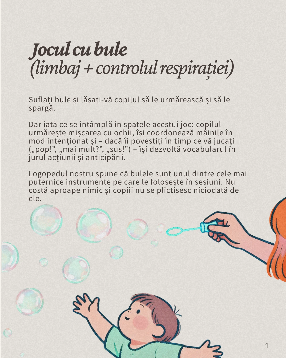
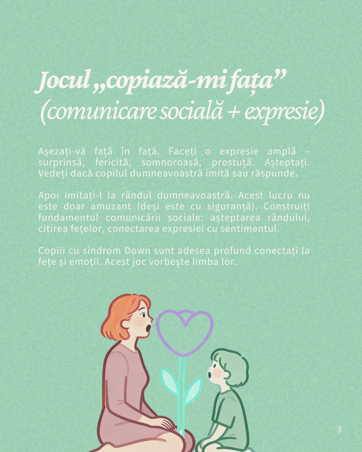
Every touchpoint is warm and honest, never overwhelming. Journals, t-shirts, newsletters and playful activity pages for children all speak the same calm language.
Where families grow together.
What changed
Extra 21 now has an identity that is clearly its own in a crowded nonprofit world, and a base for programmes, social media and advocacy that truly reflects their mission.