Slow Flow
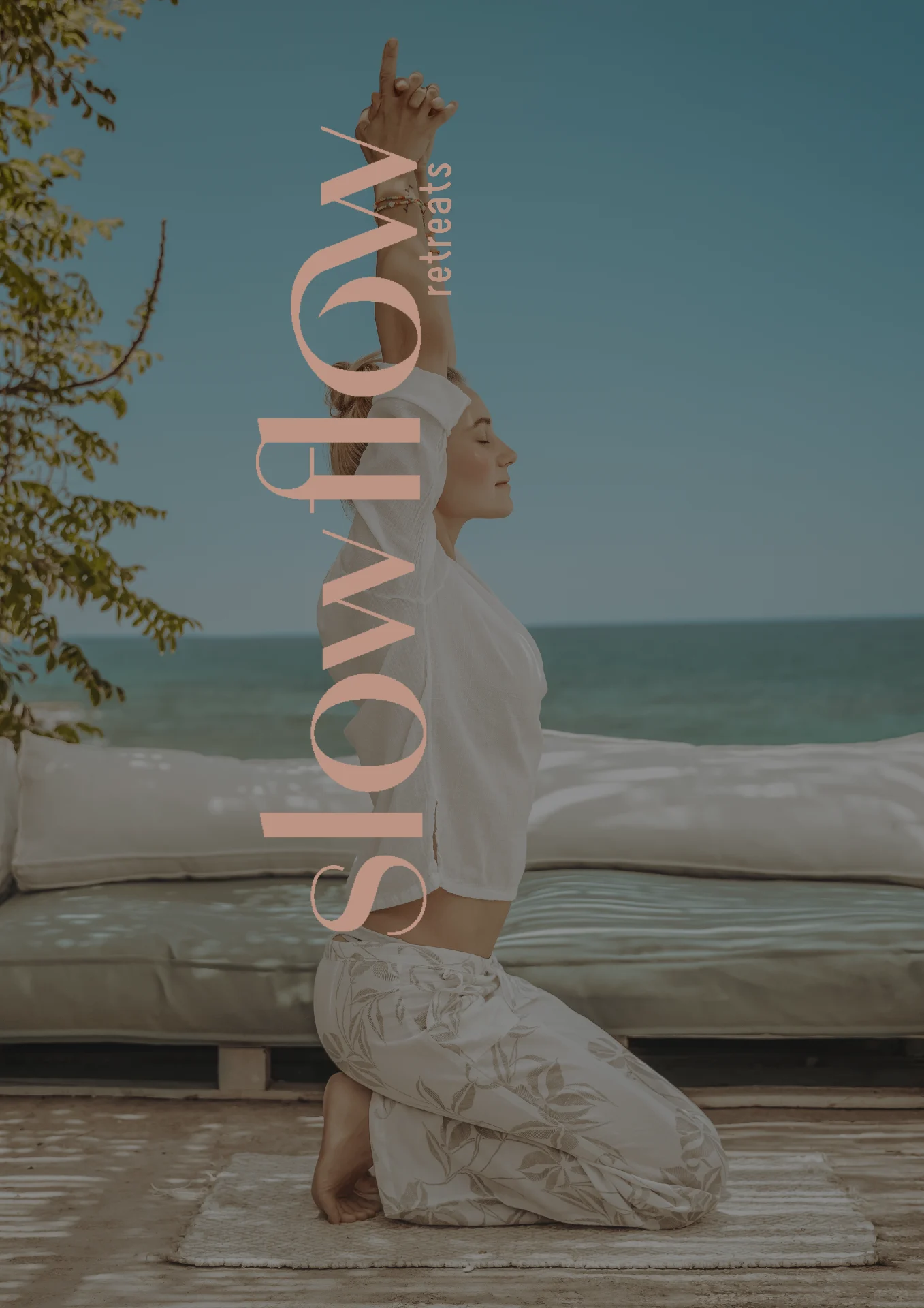
Retreats that promise a homecoming, not a holiday.
Scope
Brand strategy · Visual identity · Logo · Colour · Website design · Merchandise
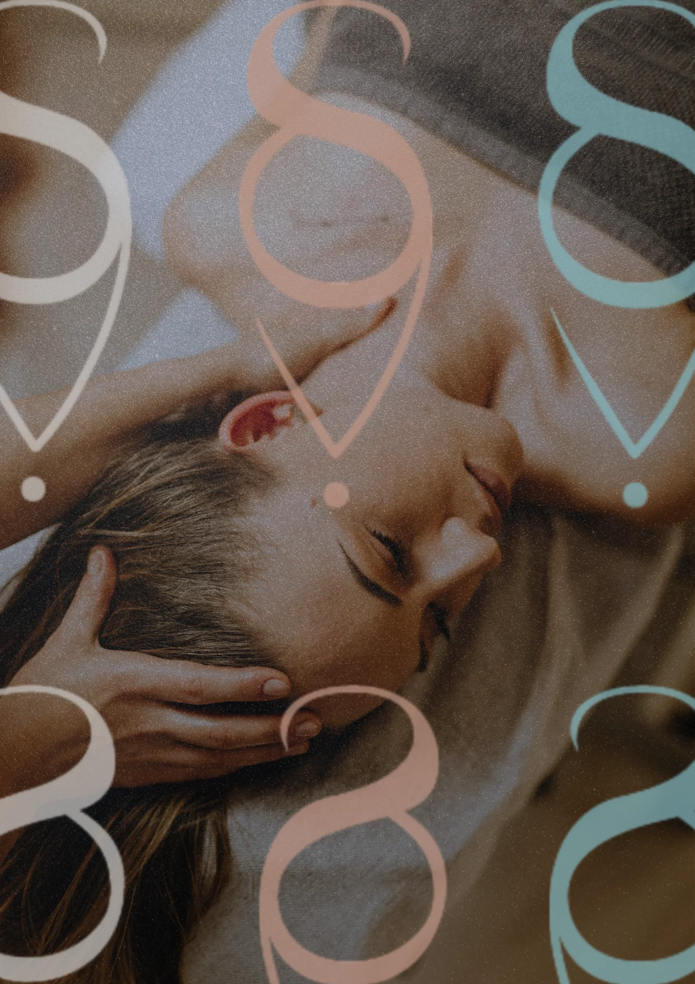
A return to self
Slow Flow is a sanctuary created by women, for women. They run wellness retreats in beautiful coastal places, helping accomplished women step away from burnout and back to their strength and clarity.
The heart of it was deep, but the old look was a whisper. It spoke of holidays when they were really offering a homecoming.
We started from one idea: the brand should be a mirror to the true self. Softness and strength, held together. We tried many directions and let go of the clichés quickly, until the language felt honest.
The identity
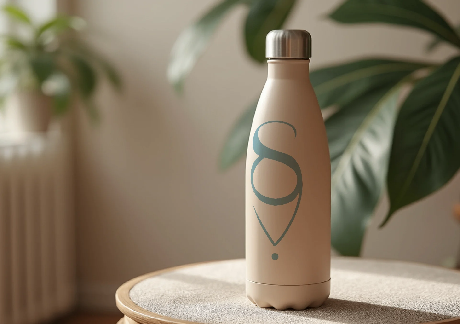
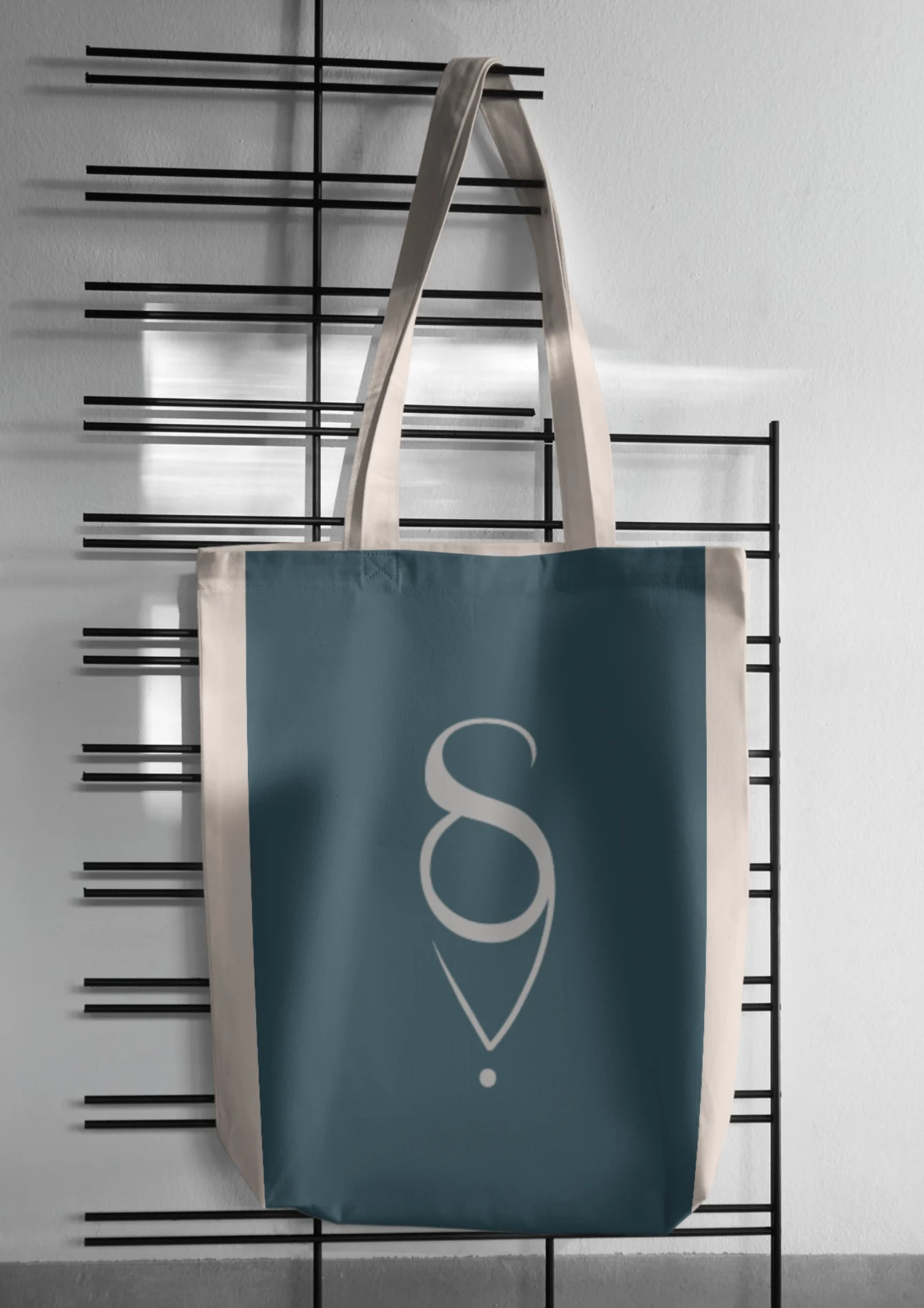
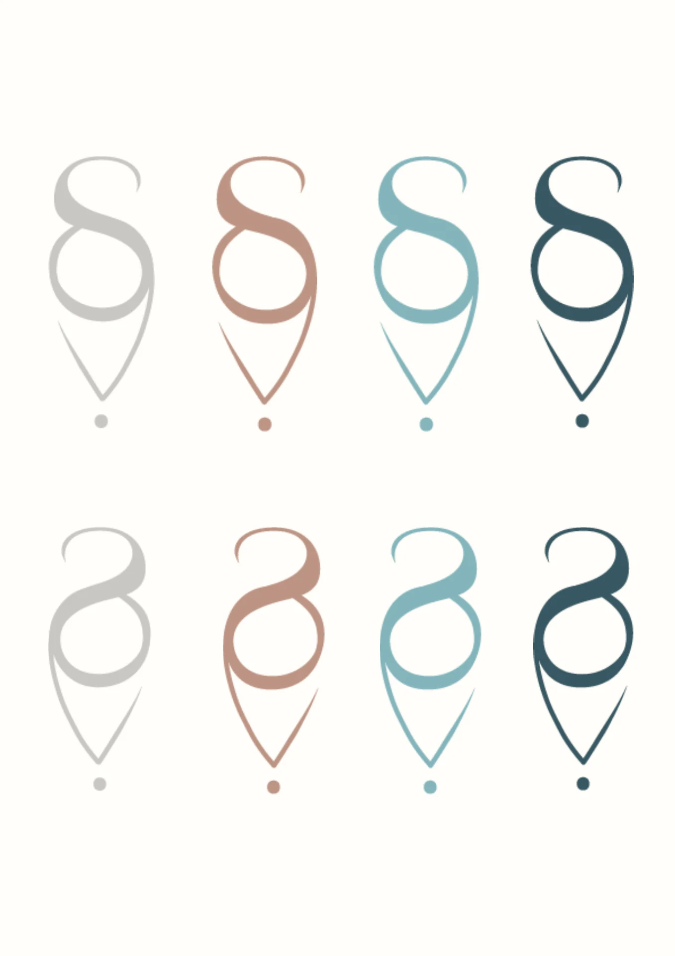
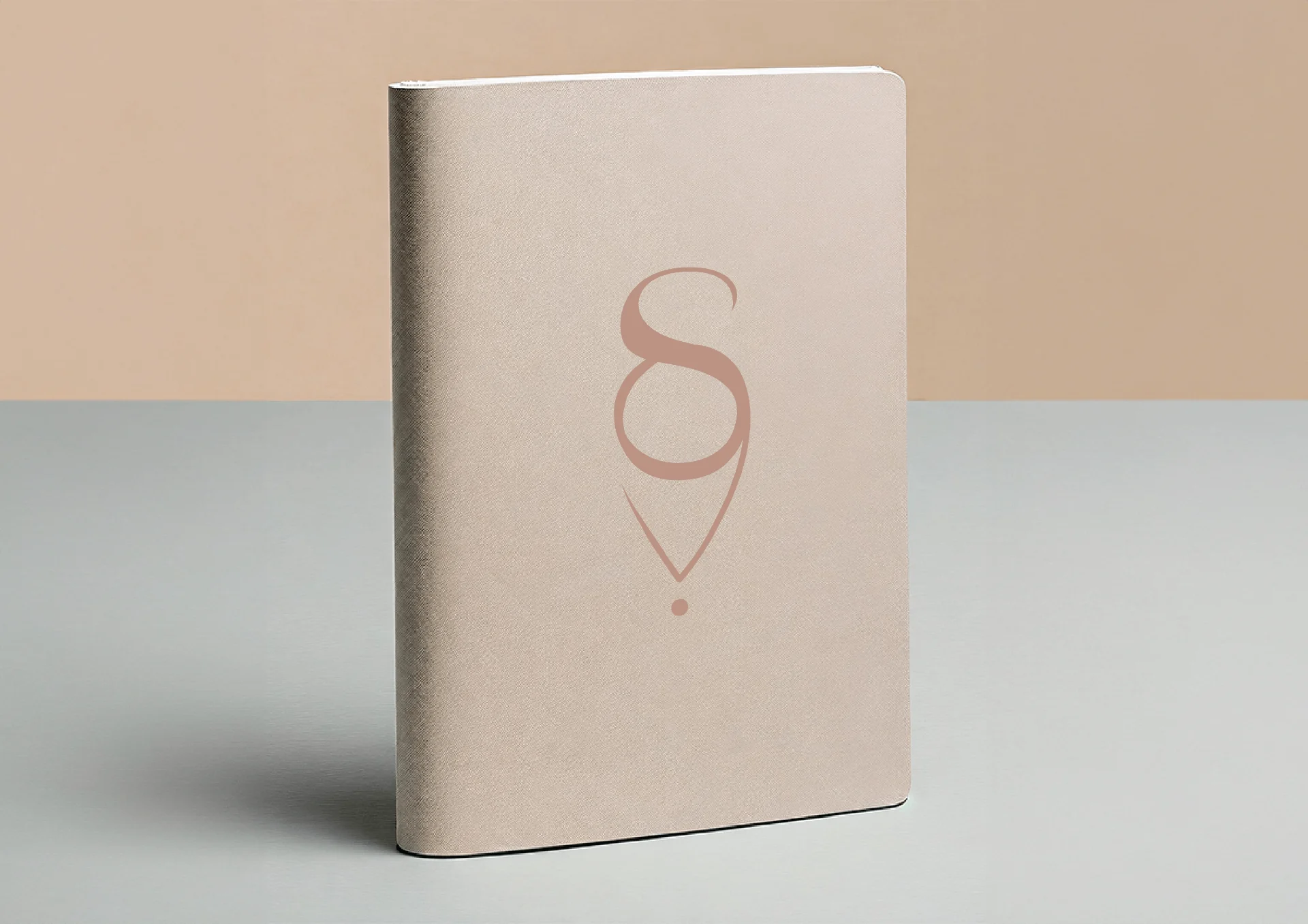
The logo is a single unbroken line that draws the S. It curves and flows, like each woman's own path, and ends in one grounded point: the moment she finds her centre.
The colours come from the sea and the body: deep ocean blue, the soft teal of healing water, dusty rose and a warm earthy beige.
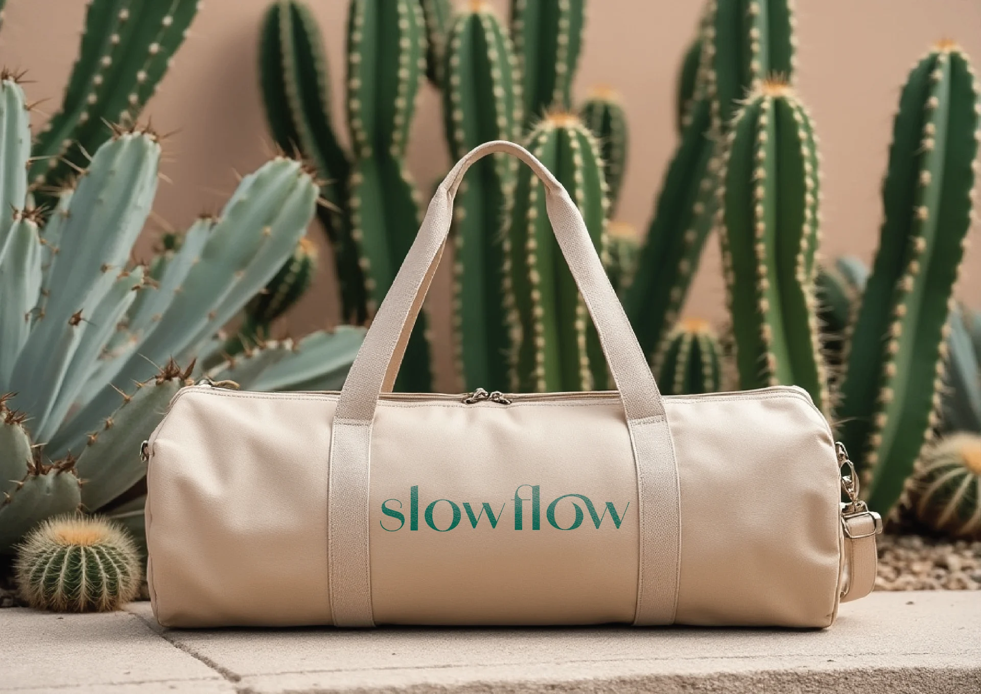
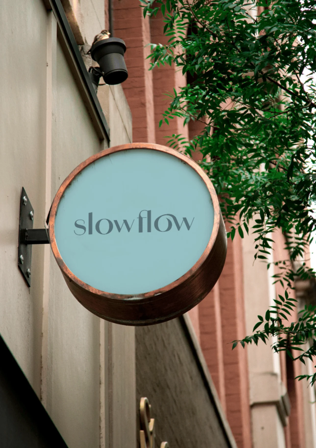
A homecoming, not a holiday.
What changed
Slow Flow now has a calm, elegant presence that speaks straight to the women it's for, and gives them permission to slow down and invest in themselves.